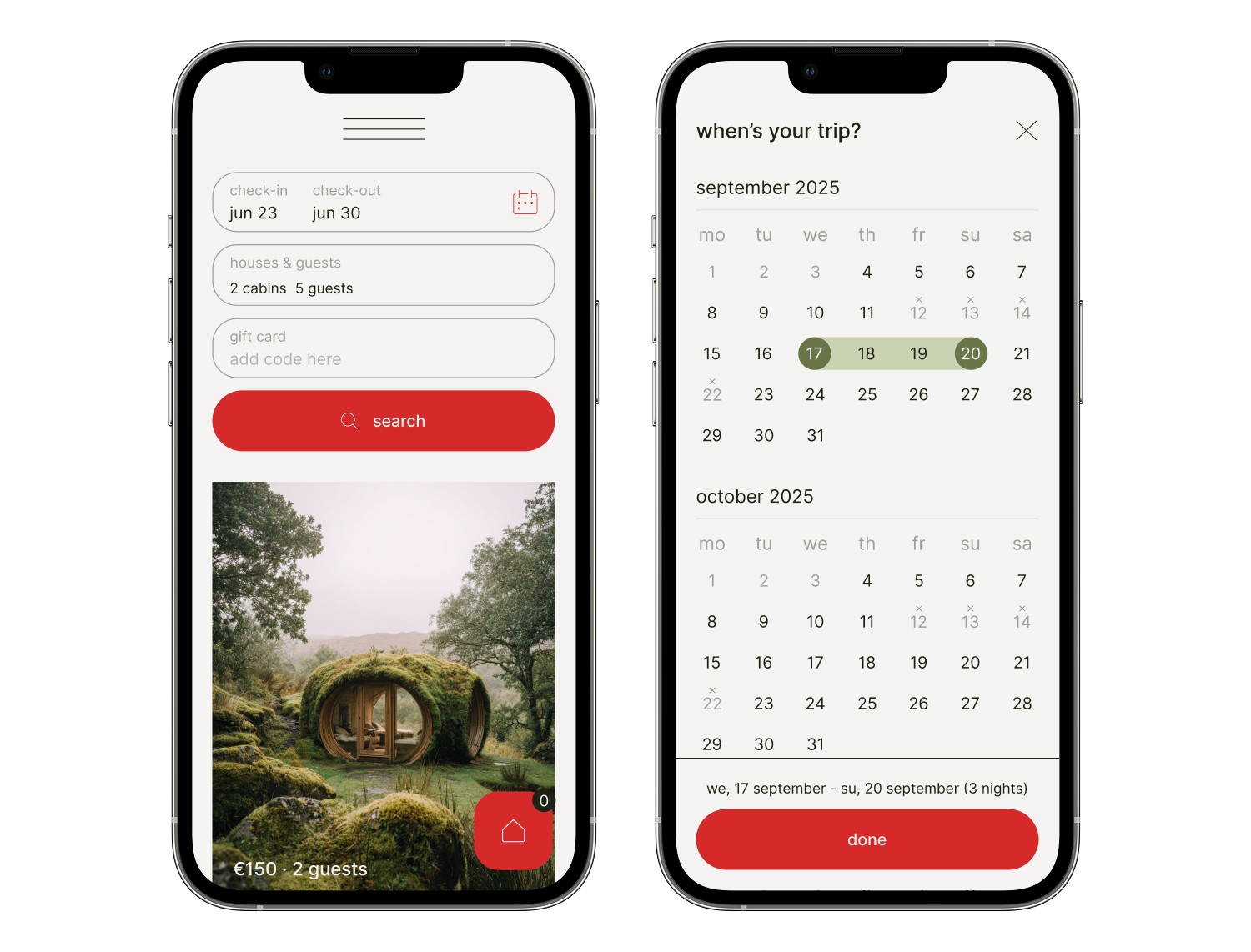
Hide & Tree, online booking
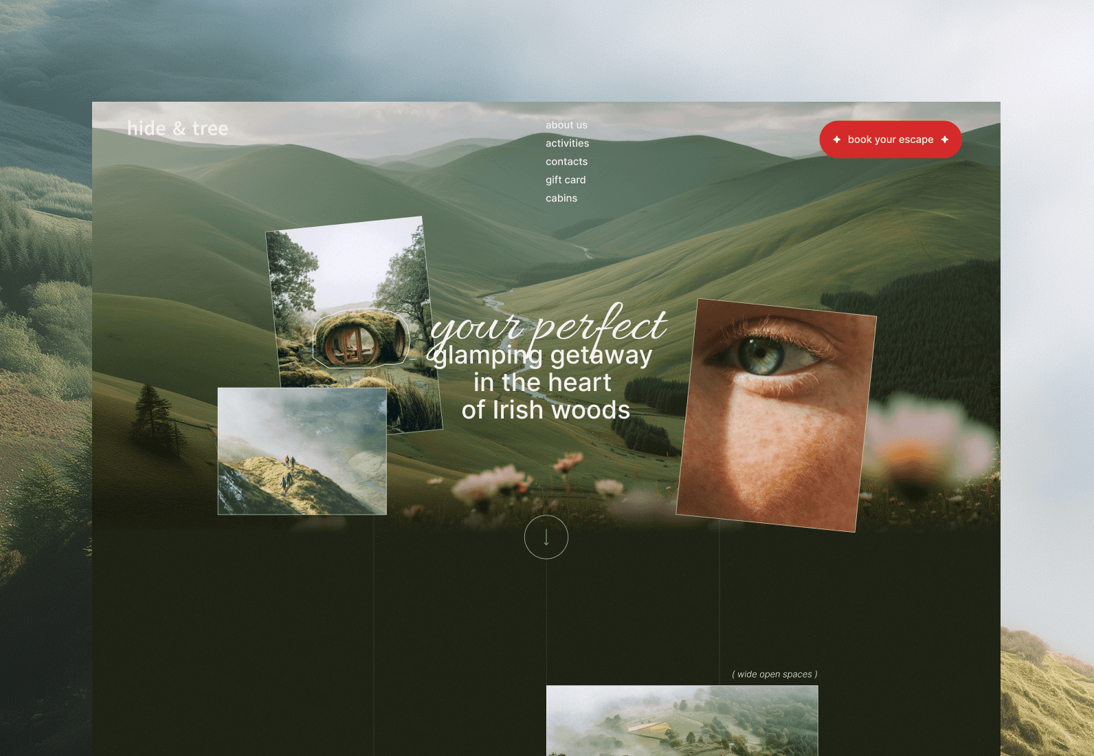
What stops people from booking a glamping getaway, and how I fixed it. A website concept for a glamping site in Ireland — a place for people who want to escape the hustle and bustle of the city and spend a few days in nature. The task: to create a website that inspires people to visit, helps them choose the perfect cabin, and provides a quick and seamless journey from selection to online booking and payment.
UX/UI Design
The Problem
I started with my own user scenario: I tried to book several glampings through existing websites.
Almost everywhere, I encountered the same barriers:
you have to select dates even before you see the options;
prices are often hidden;
instead of online booking, you have to submit a request and wait for a response;
it is unclear where the cabins are located and what is available on-site;
it is difficult to compare different options with each other.
As a result, the user wastes extra time even before making a decision about the trip.
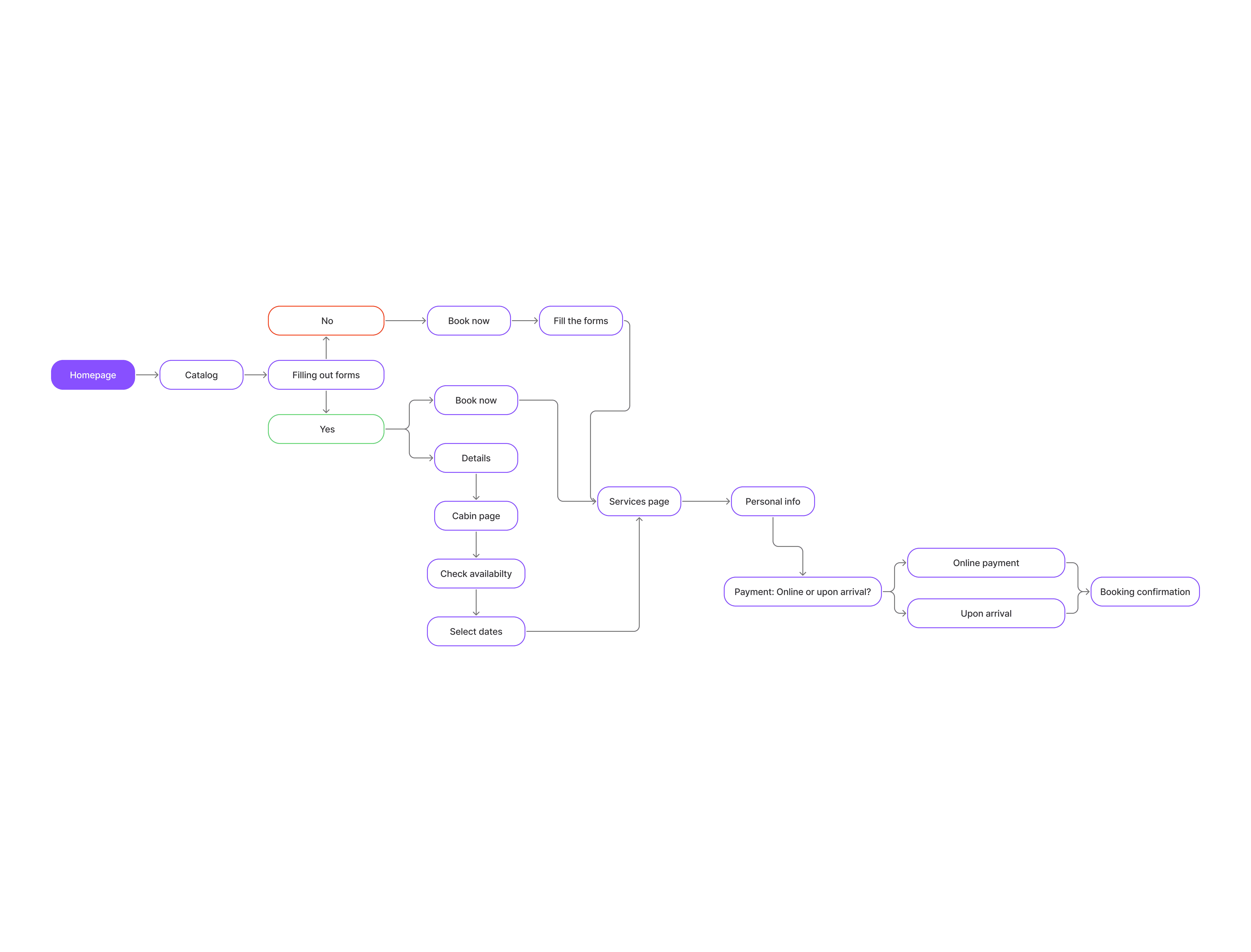
User flow
The Solution
I built the website around a natural user scenario:
explore → compare → choose → plan → book.
Show options immediately
Cabin cards show the price, main characteristics, and allow users to compare options without prior date selection.
Show the area
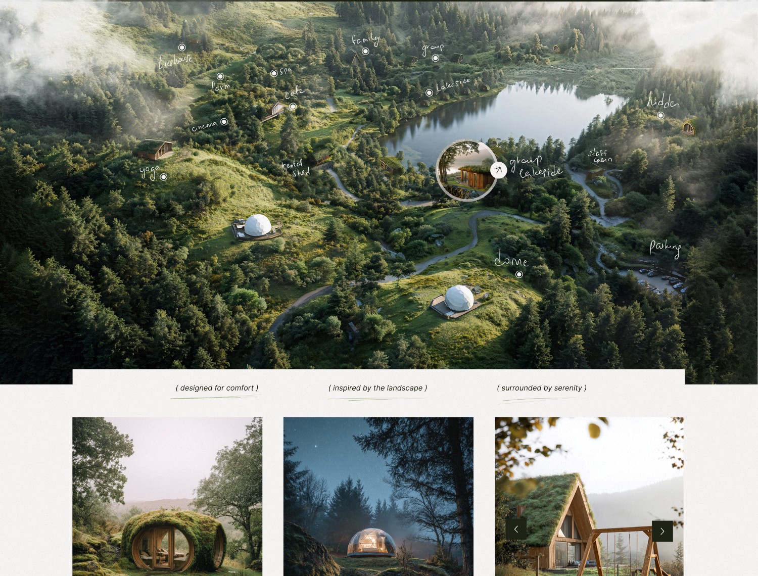
An interactive map helps users quickly figure out where the cabins, cafe, spa, and activity zones are located.
Simplify booking
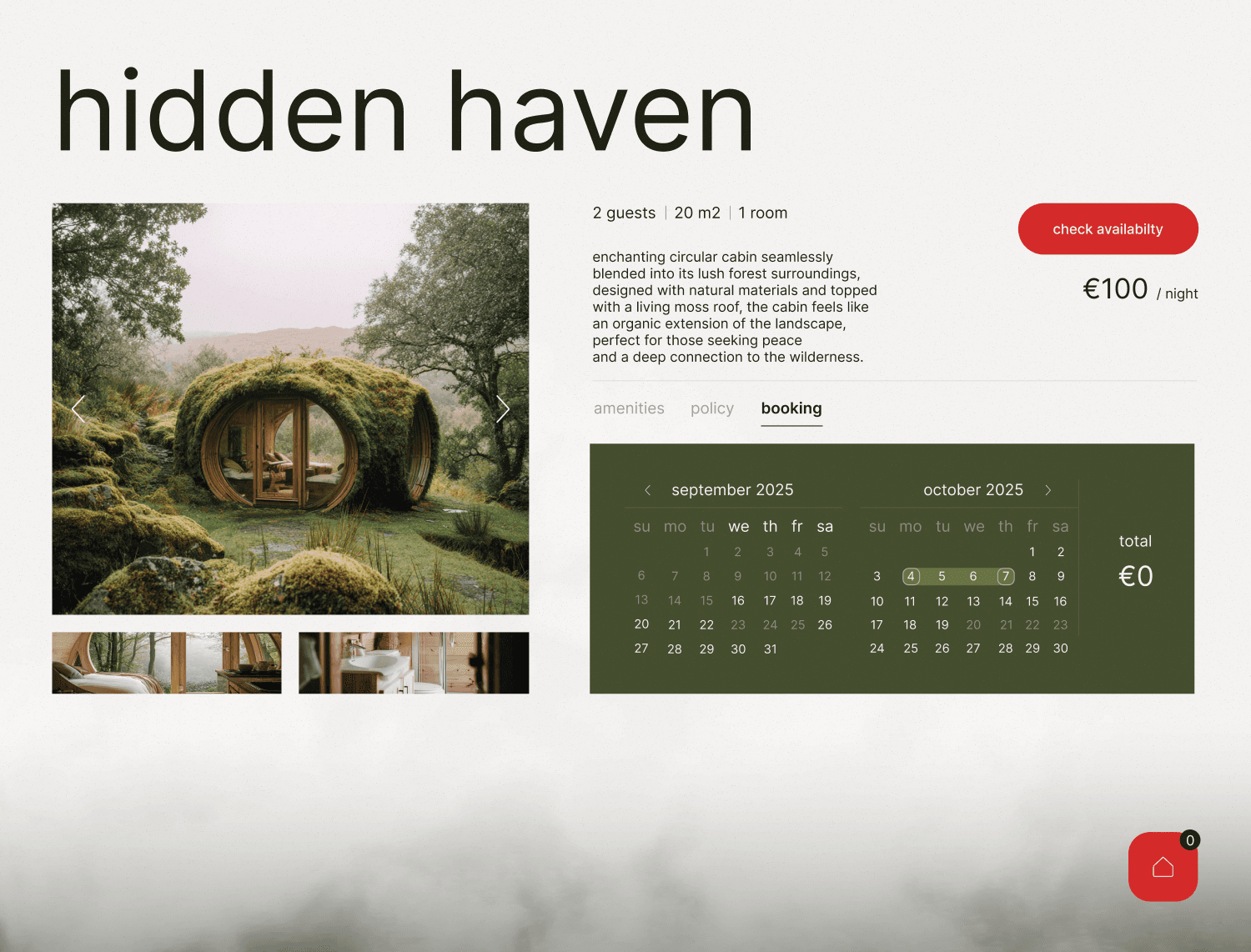
The user independently selects a cabin, dates, number of guests, and additional services, and then pays for the booking online.
Help choose a vacation format
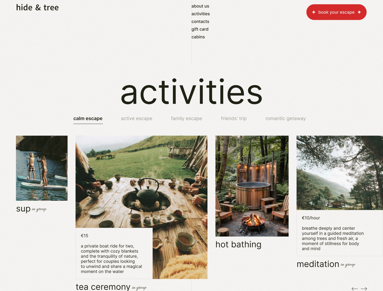
Ready-made scenarios—a romantic weekend, a getaway with friends, relaxation, or active recreation—help those who have not yet decided on a trip plan choose a suitable option.
Remove the transport barrier
A separate block shows how to get there by car, bus, or transfer, with route details.
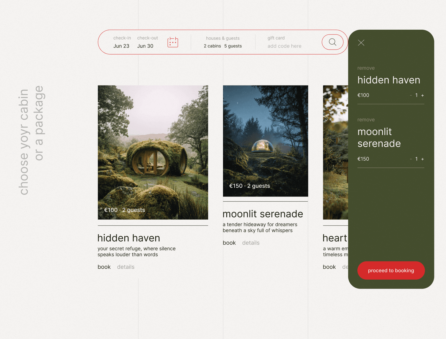
Cabin page
Business Result
The website becomes a full-fledged sales channel: it attracts attention to the glamping, helps choose a vacation option, and allows users to complete and pay for booking independently.
Visual Concept
The visual language is built around the nature of Ireland—deep green color, large photographs, an airy grid, and accent details.
The task of the visual style is not just to create a beautiful atmosphere, but to convey the feel of the place even before the trip: nature, privacy, coziness, and freedom.
Business Result
The website becomes a full-fledged sales channel: it attracts attention to the glamping, helps choose a vacation option, and allows users to complete and pay for booking independently.
Are you thinking about a new website or a redesign?
Write to me. I will look at your current website and point out several growth areas that could affect product clarity and the user journey to submitting a request.
Wireframes
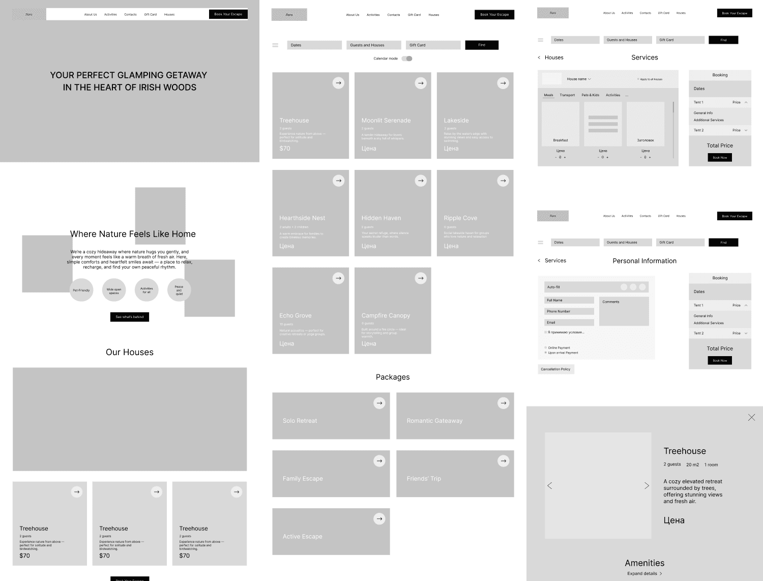
Responsive layouts