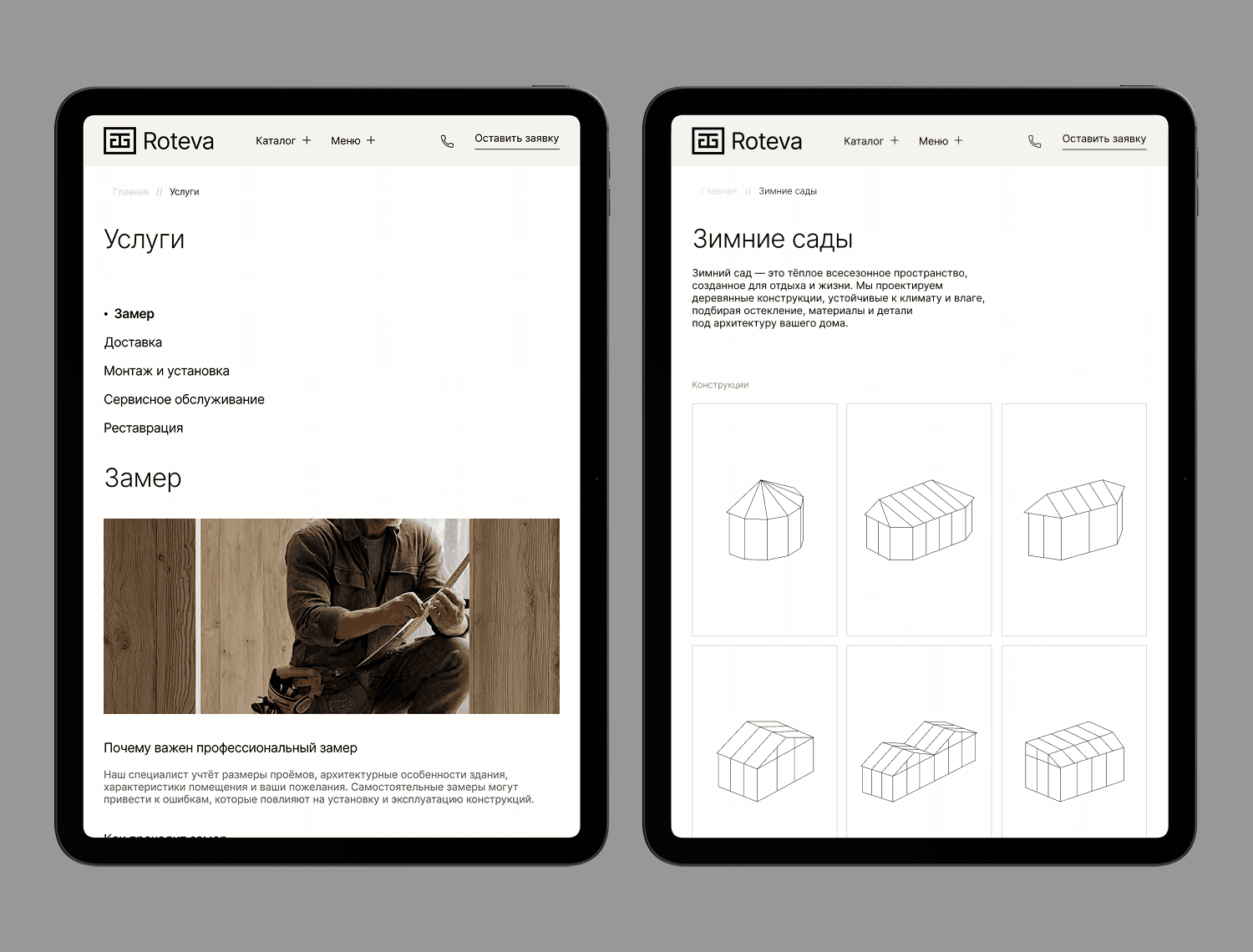
Roteva, corporate website
How to turn a complex technical product into an easy-to-understand website. Roteva manufactures custom wood windows, doors, and large architectural structures. However, it was difficult for the client to understand what to choose, why they should trust the company, and what to expect from a custom project. I designed the website from scratch to structure complex information, showcase the company's advantages, and guide potential clients from product introduction to inquiry.
UX/UI Design
The Problem
The company experienced an unstable flow of orders, and custom projects were accompanied by a large number of questions.
It was difficult for potential clients to:
understand how Roteva differs from competitors;
comprehend technically complex products;
evaluate production quality;
understand the manufacturing process and timelines;
choose the right solution.
At the same time, the website had to cater to several audiences at once: private clients, architects and designers, dealers, and construction companies.
The Solution
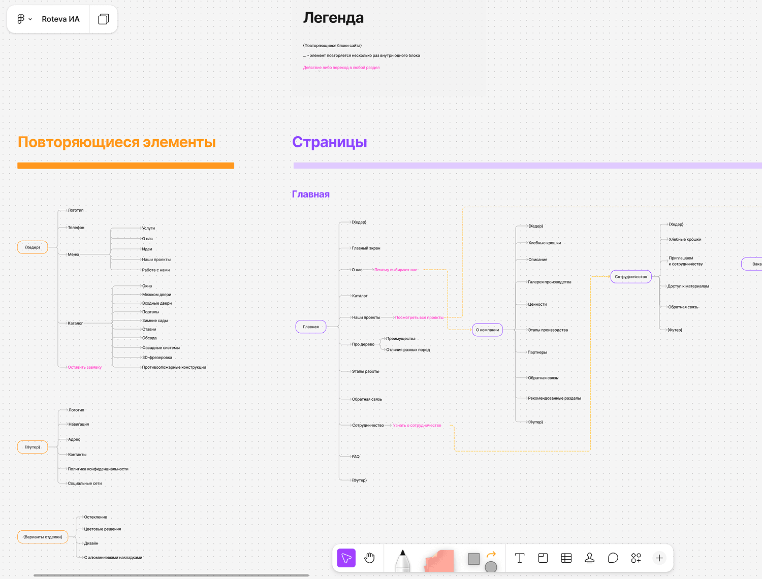
I conducted business and competitive research to identify key user barriers and build the website structure around them.
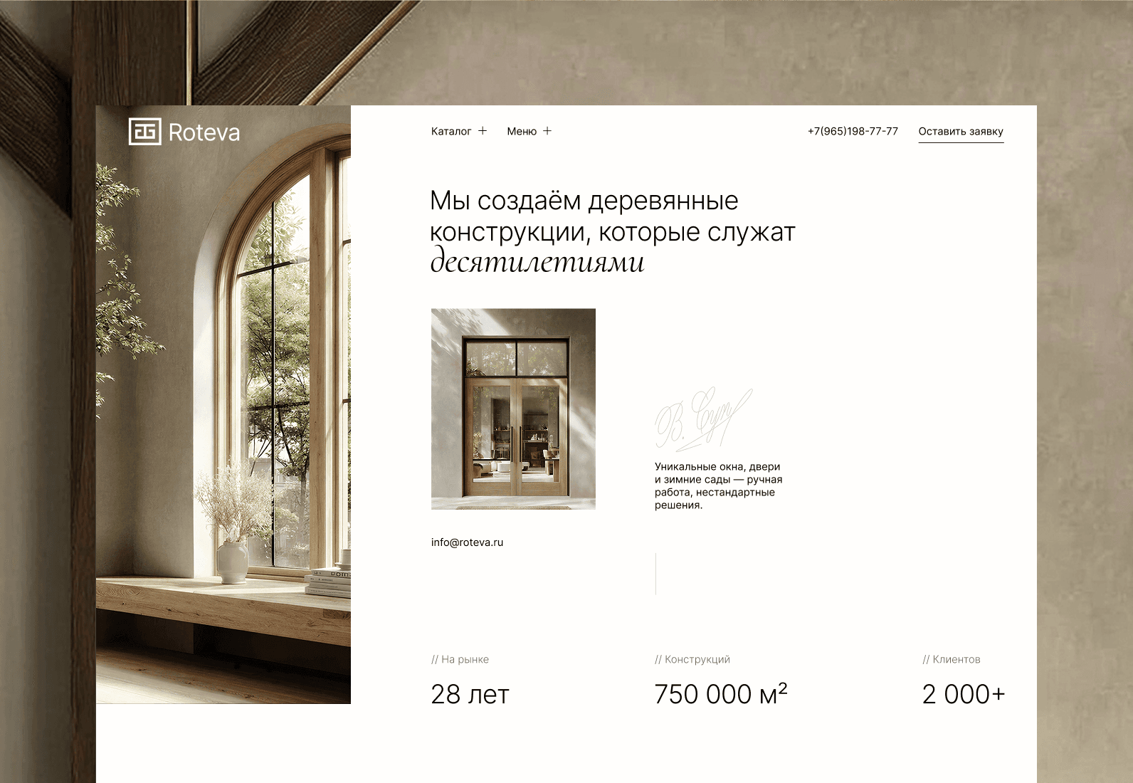
Made a complex product understandable
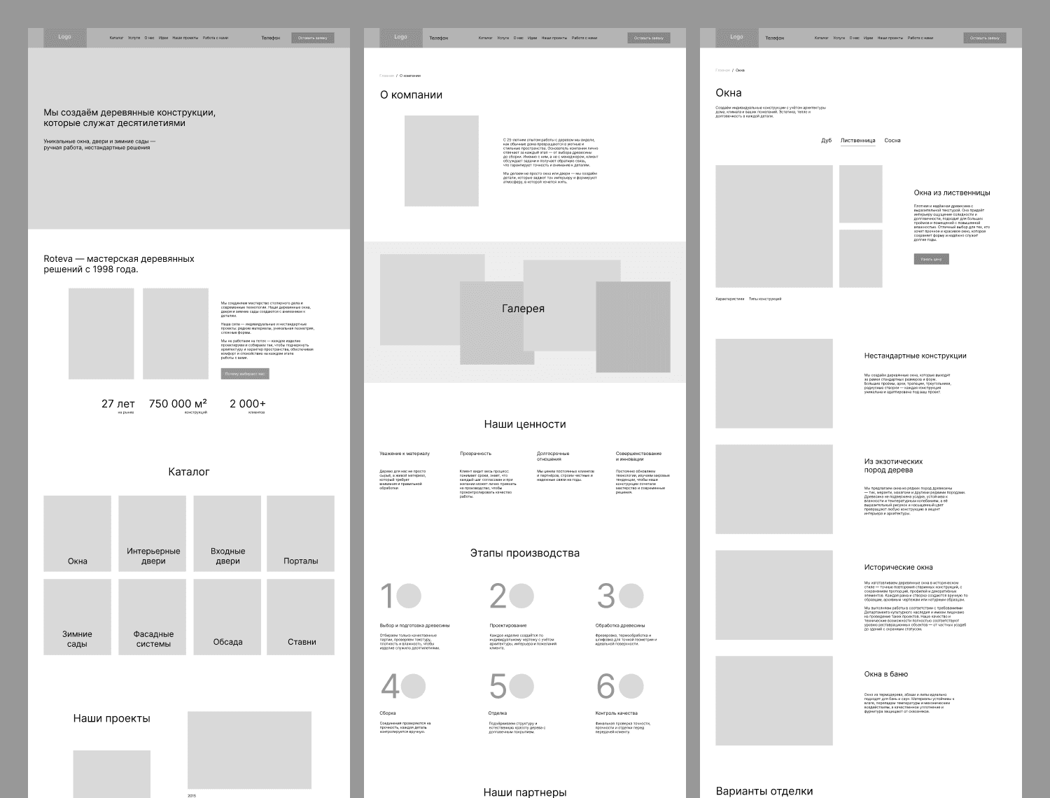
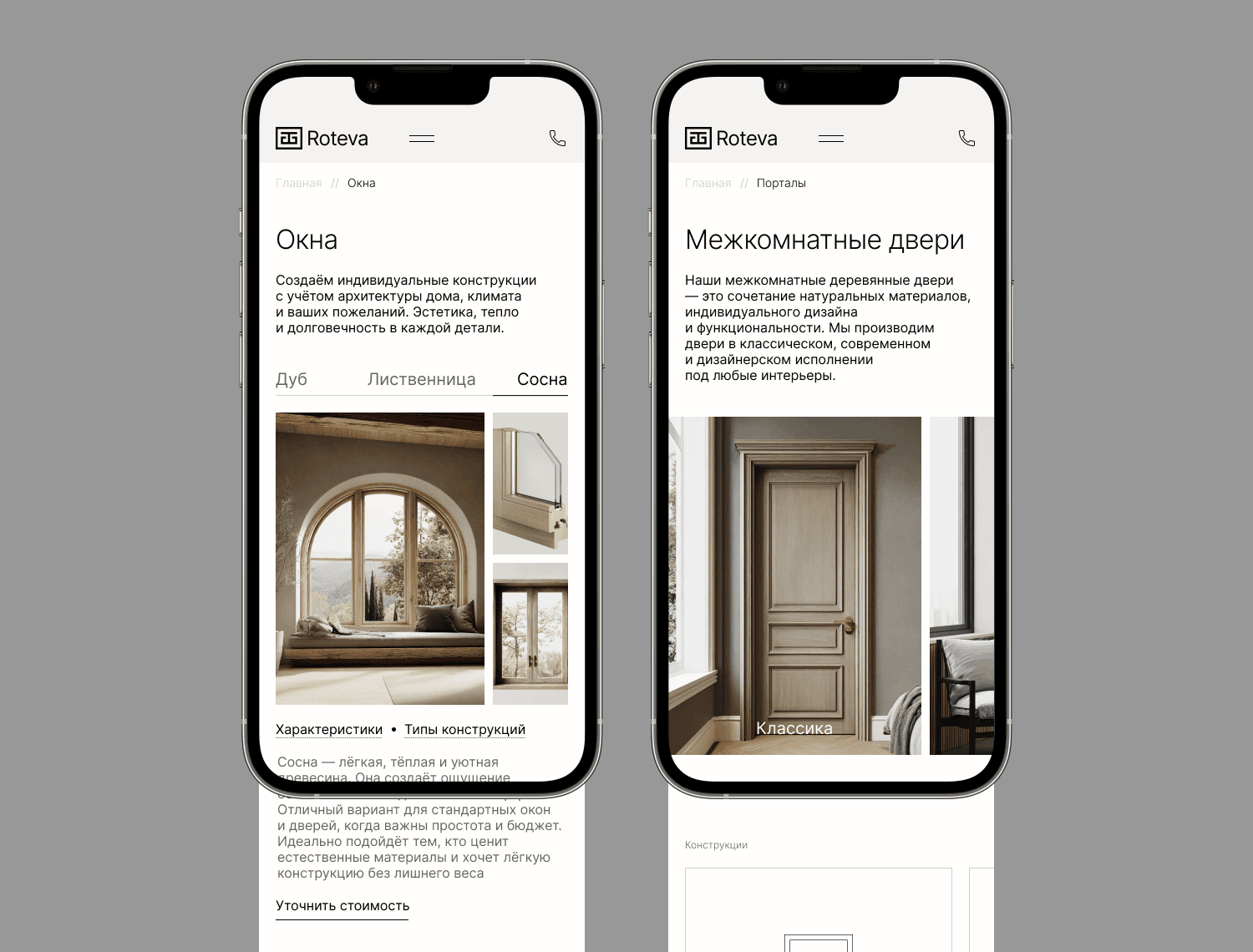
I divided technical information into two levels: main benefits in the primary content, and detailed specifications in dropdown blocks.
This way, the user first grasps the essence of the product, and then can dive into technical details.
Added proof of quality
Instead of using heavy text, I placed emphasis on real projects, manufacturing photos, and the company's experience.
This shows product quality through actual examples rather than promises.
Accommodated different user scenarios
For architects, designers, dealers, and construction companies, I created a dedicated partnership section with the option to submit a project for cost estimation.
I also added "Ideas", "FAQ", and "Careers" sections to address additional business goals: inspiring potential clients, answering frequent questions, and attracting talent.
The Result
The website helps Roteva:
Build trust even before the first contact with the company;
Show the product's value instead of just listing its specifications;
Address the main questions and doubts of potential clients;
Help with choosing complex, customized solutions;
Attract different audiences — private clients, architects, designers, and dealers;
Guide the user towards reaching out for a consultation or quote.
As a result, the company got a website that doesn't just tell about Roteva, but helps sell a complex product and shapes the first impression of the company.
Information Architecture
Wireframes
Are you thinking about a new website or a redesign?
Write to me. I will look at your current website and point out several growth opportunities that can impact the clarity of the product and the user's path to inquiry.
Responsive Design
Mobile
Tablet