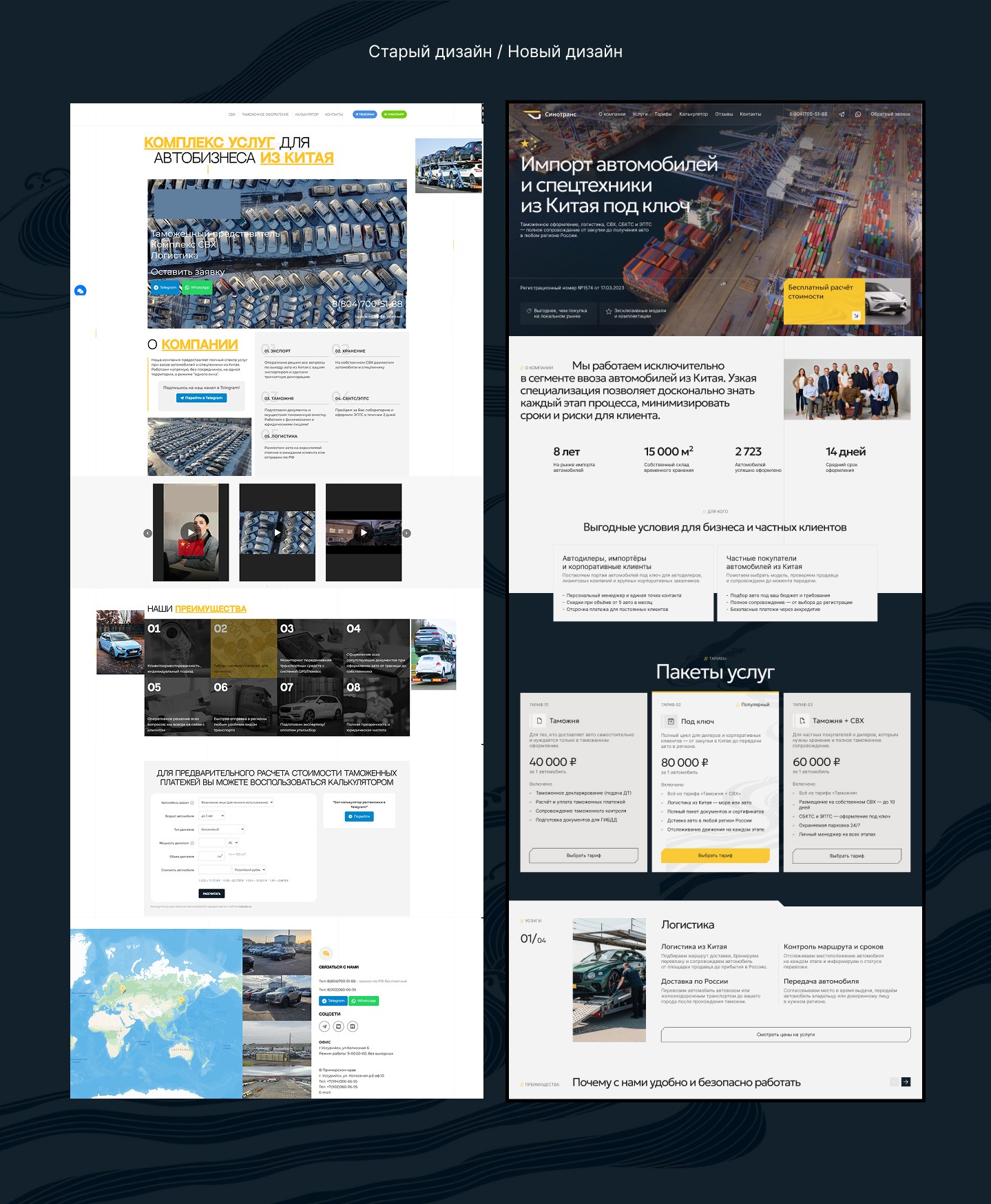
Sinotrans, redesign of the customs broker landing page
How to turn a customs broker's landing page into a tool of trust. "Sinotrans" helps to import cars and special equipment from China on a turnkey basis: from export and logistics to customs clearance and paperwork. For the client, this is a high-cost and high-risk service: they must be confident that the car, the money, and the entire process are under control. Task: to create a website that builds trust in the company, makes the registration process transparent, and helps a potential client make the decision to reach out.
UX/UI Design


The Problem
A client turns to a customs broker because they must be sure: the money and the car will not get lost somewhere between China and Russia. In this category, the interface works not as a storefront, but as a proof of reliability.
The market is highly competitive: at least four players (vlb-broker.ru, clearco.ru, vostok-broker.ru, azway.ru) sell the same "turnkey" service and compete not on price, but on trust and process transparency. The company's website needed to meet the same trust criteria as its strong competitors.
Research
I compared four direct competitors across approximately 15 criteria: USP, sources of trust, team presence, page structure, feedback forms, guarantees, and conversion mechanics. Separately, I conducted an audit of the current landing page — mapping out issues directly on screenshots: what hinders information reading, where contrast is lost, which blocks compete with each other for attention.
Key conclusions:
Trust in this category is built on five recurring elements: legal details, years of experience, real people (photos of the team and warehouse), process transparency, and numbers. Discounts and loyalty programs have almost no effect on the decision — none of the competitors have them.
The more working digital tools (calculators, VIN search) there are on the site, the lower the perceived barrier to entry.
Contact scenarios competed with each other: three phone numbers, messenger buttons, a separate bot, and a channel — with no explanation of how one differed from another.
Key Solutions
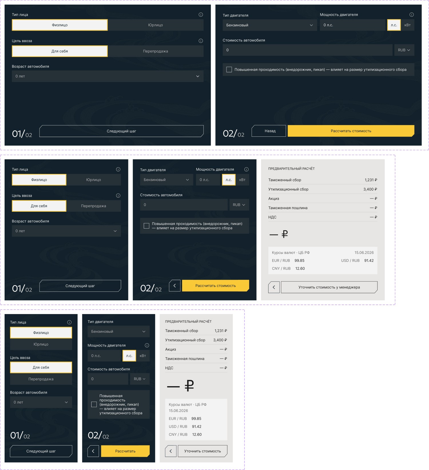
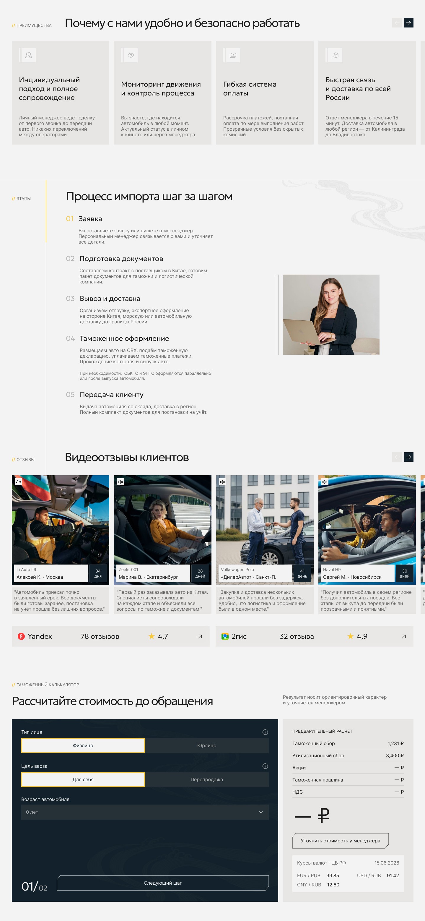
1. A predictable calculator instead of the "will they show the calculation or not" issue. Problem: the user entered car parameters but didn't know in advance whether they would get the amount immediately or be redirected to leave contact details — the result depended on chance rather than the tool's logic. Solution: a two-step calculation with a guaranteed visible breakdown — customs duty, transport fee, total amount, exchange rates.
2. One path to submit an inquiry instead of five competing buttons. Diverse communication scenarios did not help users choose, but rather scattered their attention. I made the main scenario a short inquiry form with a confirmation screen, while transferring messengers to a secondary role in the header and footer.
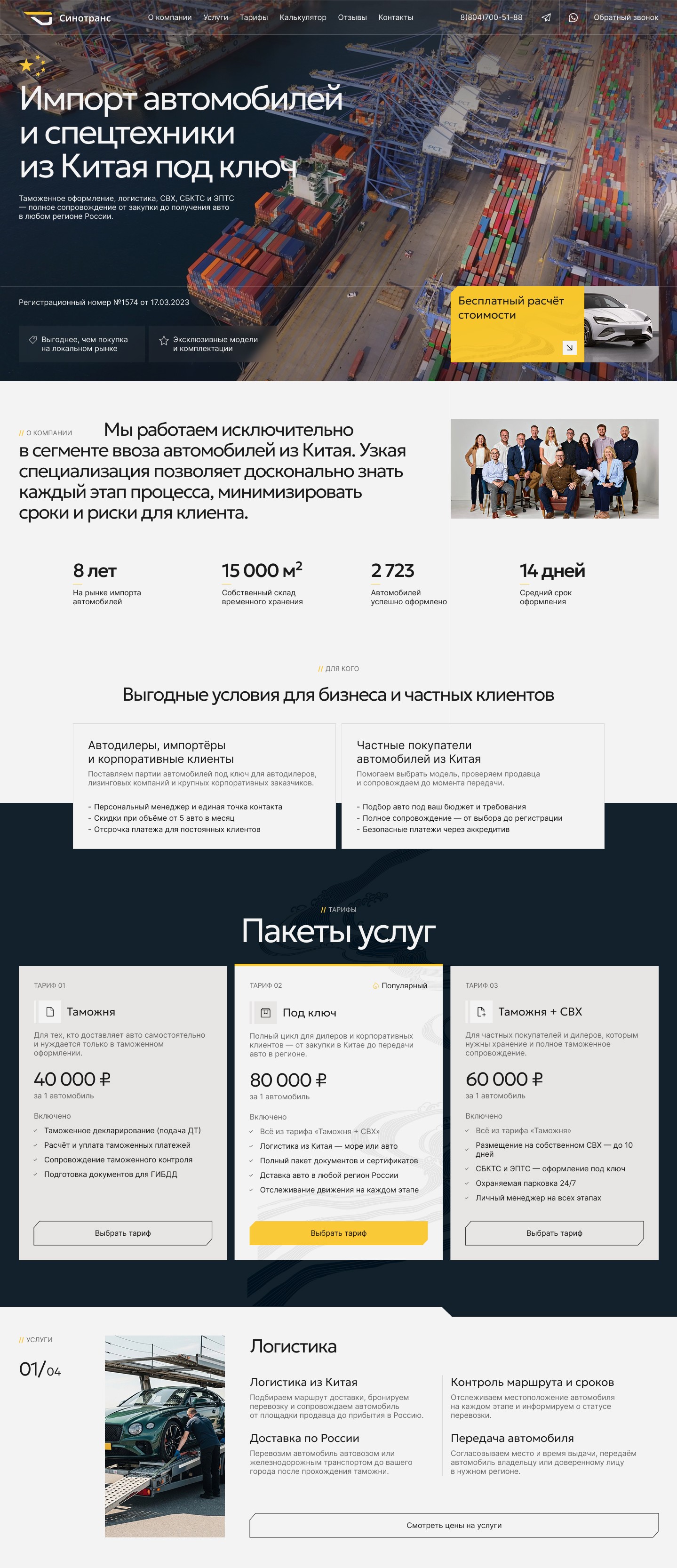
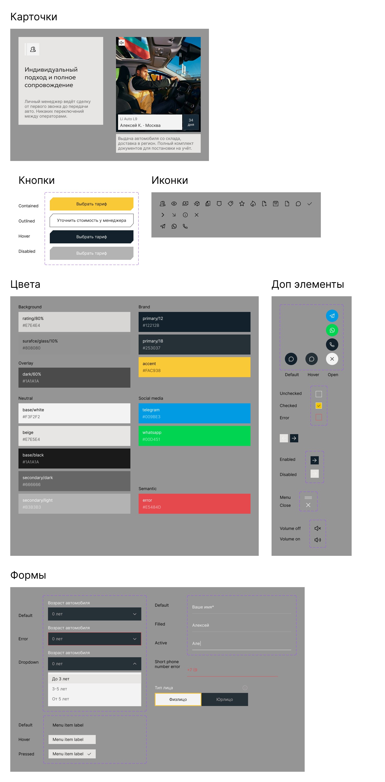
3. A unified visual system instead of a set of disjointed solutions. Headings of different sizes, numbers in different fonts, benefit cards that were too similar and hard to remember — the page read like a collection of fragments. I assembled a heading scale, a card grid, and button components with explicit states, while preserving the company's signature black-and-yellow palette and style — not a brand redesign from scratch, but translating it into a system.
4. A contact block with hierarchy instead of a text wall. Three phone numbers and an address were presented with equal weight, without separating "where to call" and "where the office is." I designed the inquiry form as a component with a full set of states — from an empty field to a successful submission screen — to make contacting through the site a predictable and complete scenario.
5. Positioning through narrow specialization. In the "About Company" block, I put the emphasis on phrasing about narrow specialization — import specifically from China, rather than "any country." This should be perceived not as a limitation, but as expertise: the narrower the focus, the deeper the company knows typical problems and nuances of the process. Alongside is a team photo, which adds a human layer; according to the competitive analysis, photos and roles of the team were a rare but noticeably trust-building element.
Calculator, steps, and responsive layouts